Dreamweaver

In a tutorial I have learned the basics of how to construct a website on Dreamweaver, a programme that I have never used before. To start with I found it quite difficult to use Dreamweaver because I haven’t used codes/coding before so that was new for me and confusing. But after a while and going through the instructions again I began to understand how the codes work in design view and what they do. I also learned what some of the codes mean and how to use Dreamweaver in general. This will help when constructing the website for our neo-noir film ‘Sicarius’.

Screen Shot 2015-02-02 at 11.48.55 Screen Shot 2015-02-02 at 11.51.59 Screen Shot 2015-02-02 at 11.58.31
Terminology:
HTML – Hyper Text Mark-up Language (readable in any browser)
CSS – Cascading Style Sheet (can develop a website and put it in html)
Index File – Website goes straight to this
Splash Page – Initial page to enter website, introduces website (stereotypical convention of film website, not typically used in normal websites)
<br> – Break (tells browser to move down one line)
<br/> – The end of the command
<p> – New paragraph

Screen Shot 2015-02-02 at 11.36.35Screen Shot 2015-02-02 at 11.27.32

DSLR Camera

In a tutorial I have learned about the DSLR camera (Digital Single Lens Reflex) and how to use it effectively to capture high quality images. I haven’t encountered the DSLR before so this was now information for me and I think this will help me when I take the pictures for the magazine front cover. This camera will be better to use because you have more control over the end result meaning you get better quality images than the digital camera I used in AS when taking pictures for my music magazine.

Aperture: Effects the video – the lower the aperture, the smaller the depth of field (more blurry background)
Prime Lens: This will be better to use than a zoom lens because the focus is better and effective due to the fact you physically move the camera around. Makes the compositions better (shows that you have thought about the composition/positioning of actors and objects)
ISO: Balances out light entering the aperture. The higher the ISO, the more sensitive the film is to light. For example, if it is a sunny day the ISO would need to be lower because too much light would be entering making it overexposed which would ruin the quality of the image if the ISO was too high (ISO 100 is recommended). If the environment is too dark and the ISO is low then the image becomes underexposed (ISO 1000 is recommended)

Sight & Sound – Textual Analysis

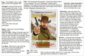
2013-02-mag-shadow_2100Sight & Sight magazine in a serious and independent magazine that is targeted at a niche audience of educated film experts as it is very information heavy and focuses on more on directors, auteurs and independent and art house films. This is seen in the magazine cover as the splash is about the western film ‘Django Unchained’ and western films tend to have a niche audience as it isn’t normally mainstream (specific genre). Also, the film is an classified as an 18 by the BBFC which suggests that the magazine has an older demographic (18-50) as they will be able to watch the film and understand how the film pushes boundaries from a mature perspective. The splash informs the audience that the main article in the magazine focuses on ‘Django Unchained’ and the coverline in bold red font indicates that story will focus on the director, Quentin Tarantino and the same cover-line and main image also implies that the main story will focus particularly on Jamie Foxx’s role in the film as well (as he plays the main character). However, the text with Foxx’s name in it is in a small font which reflects the idea that the magazine doesn’t focus on actors in as much detail as more mainstream film magazines and hybrid magazines such as celebrity gossip.

The main image is a large mid shot, straight angle of Jamie Foxx’s (well known actor) character from ‘Django Unchained’ which also emphasises the idea that Sight & Sound focuses more on the actual film than the actors. The image supports the anchorage text, which is the main cover-line that refers to the film (and actor and director), because the image features a character from the film. The image is placed in front of the masthead which gives it a 3D effect as it makes the image look like the character is pointing the gun at the reader (the camera distance of Foxx’s hand holding the gun is very close). The image also uses direct address (the character is looking into the camera) which directly interacts with the audience to obtain their attention as the magazine wants a close relationship with the reader and wants them to be attracted to the magazine so that they can purchase and read it, so the publishers can make money from this. The cowboy-like hat and gun are stereotypical conventions of a western film (iconography) along with the brown colours, so this gives the readers a visual interpretation of the western genre of the film. His facial expression is quite serious and wary (as if he was going into battle), which conveys to the audience that there is action and violence in the film (also indicated by the gun).

The masthead is large and bold and is placed near the top of the page in the centre which stands out to the reader so they automatically know which magazine it is as it is the largest text on the page. The font of the text is different to the fonts of other text on the cover, which is typical across many magazines, to make it recognisable to the audience as a specific font (own brand). The font is serif which has connotations of professionalism and also indicates that the magazine is well respected and traditional (Sight & Sound was first established in the 1930s). Therefore, readers will trust the magazine because it has been around for a long time. The colours in the masthead are red and yellow which are basic colours to make the magazine cover look classy, reflecting its educated, adult audience. The colour scheme of the magazine is red, yellow and white and this remains consistent throughout the front cover. The masthead also uses alliteration, the ‘s’ letters in “Sight & Sound” which makes the name of the magazine sound distinctive.

The puff (tag line), “The international film magazine” informs the audience that it is a film magazine. The adjective “international” insinuates that the magazine is well respected by the countries across the globe. The sans serif font makes the puff stand out as different to the masthead and the black colour is plain and simple which reflects the the serious nature of the magazine (information heavy). The capital letters makes the text clearer to the audience and indicates it’s importance. The puff provides support for the masthead as it gives further detail and context into what ‘Sight & Sound’ is.

The cover-lines are in bold red font in capital letters (sans serif). The text is big but not large as the main “Django Unchained” cover-line which indicates that these articles aren’t as significant as the ‘Django Unchained’ article due to the fact that it is the main article. This is further emphasised by the fact that the text of “Django Unchained” is white which is a different colour to the other cover-lines to make it stand out as the most important feature. The other red cover-lines feature the film and director names, for example “Kathryn Bigelow’s ‘Zero Dark Thirty’”, emphasising that directors are a main focus in Sight & Sound magazines. Other cover-lines are in even smaller font and the text is white and tends to be 2-3 words long, informing the audience about other articles and features in the magazine. But, the small font implies that these features aren’t as significant as the other articles referenced to in the cover-lines with larger text.

Other typical magazine conventions that are seen on the cover are the barcode, price, date, issue number/volume. These items are placed discretely on the front cover. The barcode is placed on the right side on the edge of the page three quarters of the way down and includes the price of the magazine. It is also quite small so that it doesn’t distract the audience away from other main features of the magazine. The date, issue number/volume is placed in the top right corner of the page and is also very small and discrete. It is placed simply in a box-out (black text layered on a white box) which reflects the simplistic nature of the layout of the magazine. The front cover is quite sparse as there isn’t much text and only features one image on it which is complete contrast to mainstream magazines with larger/broader audiences. The publisher’s logo, BFI, also features in the top left corner of the page. Readers would trust the magazine as the demographic that the magazine is targeted at would be familiar with the BFI because they tend to be film experts or have a keen interest in film.

Sight & Sound Film Magazine Analysis

As part of my A2 coursework, I have to construct a magazine front cover promoting the neo-noir film ‘Sicarius’ that my group and I are making a theatrical trailer for.

I have analysed a serious/independent film magazine published by the BFI called Sight & Sound. It is targeted at a niche audience that are educated readers who have expert knowledge on film and have a very deep interest in it. It is also aimed at a demographic who are interested in independent and art house films, as the magazine looks at these in more detail than mainstream magazines. It’s USP (unique selling point) is that it focuses more on directors and auteurs.

Sight and Sound Analysis

Into The Woods Website – Textual Analysis

The loading page has a plain black background which makes the website look classy and professional. The film is distributed by Walt Disney which is a successful and well-known organisation and so it would be typical for their website to be very professional. The loading bar is in the shape of a tree branch which reflects the film and its setting and also fits the theme of ‘the woods’ that is used throughout the website. This makes it easier for users to make a link to the narrative of the film and understand the main concept.

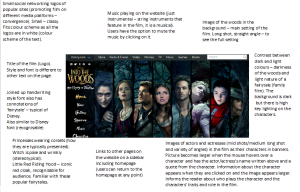
into the woods2The colour palette for the website is quite simple – white, gold/brown and a range of dark colours. The dark colours and shadows in the background image of the woods (long shot, straight angle) reflects the setting in the film because it is set in the dark woods, which is also a typical convention of fairytales (the film is based on fairytales). The title of the film has its own specific font that is different to other text that is on the website. The title is gold/brown to connote the forest and also the magical tone of fairytales. Also, the font is styled in a way to resemble tree branches to emphasise the on-going ‘woods’ theme that used in the website. The font of the links on the side navigation bar is a joined-up handwriting font which has mystical or magical connotations and this reflects the fairytale/musical genre of the film. The font also resembles the typical font used for Walt Disney which is iconic and recognisable as Disney (the film is distributed by Walt Disney). There is contrast between light and dark in the images – the darkness of the forest compared the high key lighting on the actors and actresses and different coloured costumes (e.g. Little Red Riding Hood’s bright red cape). This indicates to the audience that even though there is a dark mysterious wood, the narrative is light-hearted as it is rated PG and so is a family film for both children and adults to enjoy.

There is instrumental music playing on the homepage, which consists of classical string instruments (orchestra). This music is quite dramatic to emphasise the fact that it is a fictional film and it resembles the music that is in the film (the genre of the film is a musical). Users can decide whether they want to stop the music player via the small sound symbol. They can click on the symbol to the mute the music or let it play and this gives users more choice making their experience at the website more enjoyable. The are images of the actors/actresses in banners and the interactive nature of the website in enhanced through the movement of the images. The pictures become larger when the mouse hovers over a character and has the actor/actress’s name written above and a quote from the character including the character’s name below. Information about the character appears on the side when they are clicked on and the image appears larger and is the only picture on the page (there is also an ‘x’ symbol to exit the character profile). This gives the user more of an insight into the characters in the film and their role in the narrative without having to be transported to a completely new page. This makes it a lot easier for users to navigate.

It is clear that Meryl Streep’s character is the main character because a close up of her is placed first on page and uses direct address. Her character is the only one that gives eye contact to the camera so that it appears that she is staring at the user, whereas the other characters gaze into the distance. However, Jonny Depp’s character ‘the Wolf’ also uses direct eye contact but is partially hiding behind the tree conveying that ‘the Wolf’ may be a villainous and sneaky character in the film. The images have stereotypical representations of the characters that make it easier for audiences to distinguish between the characters and act as prompts for the users because most people are familiar with the characterisations of certain characters from particular fairytales. For example, there is a close up, high angle of Rapunzel (Mackensie Mauzy) who wears a pale pink dress and lies on the ground as if she were a damsel in distress which is a typical way for princesses to represented in classic fairytales. The high angle conveys that she is a weak character. There is a mid shot of Cinderella (Anna Kendrick) who wears dull, ragged clothes that most people will remember from the Cinderella story. There is a mid shot of The Prince (Chris Pine) who has neatly swept back hair and an extravagant light blue costume which is imagery you would associate with a prince in a fairytale. Also, the colour blue is often associated with males and in fairytales there tends to be an exaggerated difference in the way males and females are presented.

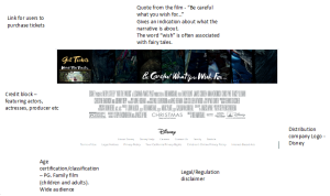
into the woods5Typical conventions of websites are seen in the official website for ‘Into The Woods’. These include: URL (web address), navigation bar, links to internal sites (which is an example of synergy), images, distribution company logo and legal/regulation disclaimer. There are also links to popular social networking sites (Facebook, Twitter, Pinterest and Tumblr) to promote the film on different media platforms which is a form of convergence and also symbiosis as they are external links to different companies. It allows users to access the details about the film via social networking which is widely used now and users can also promote the film themselves by sharing it.

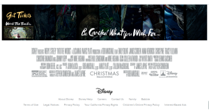
There is a quote from the film below the pictures: “Be careful what you wish for” gives an indication of what the narrative is about. The word “wish” is often associated with fairytales as it usually plays a central role. There are links to two different external ticket websites (an example of symbiosis) under the heading “Get Tickets”. Movement is seen here again as when the user moves the mouse onto the “Get Tickets” link, it changes into the logos for the ticket websites ‘fandango.com’ and ‘movietickets.com’. A credit block is also present at the bottom of the page that features the names of actors and actresses, producers etc and the logo of the distribution company, Disney. There are also other links such as ‘Contact Us’ and “About Us” and links to legal and regulation disclaimers such as “Terms of Use”, “Legal Notices” and “Privacy Policy” which are typical features of websites that provide more information for the users to feel more informed and protected.

into the woods3

Into The Woods Website Analysis – Annotations

To deepen my understanding of features of official film websites, I have analysed the official website for the recent film musical by Disney, ‘Into The Woods’. This task was useful and essential for me because as part of my A2 media coursework I will have to construct a website for my team’s neo-noir film ‘Sicarius’. Therefore, I will need to know how to construct a website and include relevant features that will reflect the nature of the film and attract the audience.

into the woods intothe woods intothewoods

Character Profile – Brendan (Brick)

After watching Brick we had to write a character profile for a character from the film. I chose to write Brendan’s character profile and had to consider demographic details, personality and his role in the narrative. I think that this task will help my group and I to consider what sort of characters we would want to portray our own narrative for our trailer.

Character Profile

Demographic

Age: 18

Gender: Male

Ethnicity: White

Social Class: Middle class

Physical Appearance: Dark brown hair, glasses, average height

Personality

Dominant:

  • Outgoing
  • Determined
  • Honourable
  • Loyal
  • Cynical
  • Independent
  • Curious
  • Passionate

Hidden:

  • Vulnerable
  • Lonely

Role in Narrative

  • He is the protagonist (cynical and world weary)
  • He plays a detective role in the film as he looks to discover the truth about what has happened to Emily. He is determined to find out who killed her and why she was killed because he was romantically linked to her (was in love with her). He will do whatever it takes to find out no matter how dangerous or life threatening it is
  • Brendan controls what is discovered next in the narrative because the film follows the story subjectively through him.

Re-editing Trailer

After receiving feedback from the theatrical trailer I cut for the noir film The Killers, I have re-cut my trailer. I decided to re-edit the sound because I felt that it wasn’t very strong. The sound levels were too jumpy as some parts were too loud and other parts were too quite, so I focused on how to use key frames accurately for the audio. Now the sound the music isn’t too loud and jumpy.

Instead of using the gun shot sounds from the actual film I got a sound effect of gun shots. This is because the the sound from the original film clip wasn’t very good quality and had dramatic music in the background that clashed with the soundtrack that was playing in the trailer. Therefore, I removed that audio and replaced it with the sound effect.

I think that my re-edited trailer is much better than my first one because the sound is better quality and I also have more sections in the trailer where the is no dialogue. I think that my sound editing skills are getting better as I am aware of how to use the key frames more effectively.

http://youtu.be/LbXZWlzUx6c

Analyising Brick – The Film

In lessons we have been watching the neo-noir film Brick to gain a deeper understanding of the neo-noir genre and narrative features. We were given a neo-noir convention each and had to try and apply these conventions to the film whilst watching it. The convention I had was ‘false accusations and betrayal’. So far I have found a few examples of this in the film.

At the beginning of the film there is a scene where a girl (Emily) is lying dead in near a tunnel in shallow water and the protagonist (Brendan) is sitting watching over her. Although Brendan didn’t actually kill Emily, the audience who are unaware of what happened to Emily at this point may assume that Brendan killed her.

p4955-joh-005

Another example is a scene near the start of the film where Brendan is in a phone box speaking to Emily on the phone. Emily is telling Brendan that she has been accused of doing something bad but that it wasn’t her fault. This indicates that Emily has been falsely accused, however I have not watched the whole film and can therefore not make a judgement.

brickphone-booth

Another example of my convention in the film is when Brendan gets himself involved in a drug business run by a man named Tug. But, Brendan isn’t working for him to help, he is just using him to solve the mystery of what happened to Emily. This is an example of betrayal because Brendan is going to go against them once he has found what he is looking for.

fhd005BRK_Joseph_Gordon_Levitt_013    brick3

This task is very useful because it allows me to understand how the conventions can be practically be applied to a neo-noir film. This may be useful for planning our theatrical trailer if we choose to do a neo-noir trailer. This will also be applicable to a classic noir trailer because a lot of the conventions originate from the classic noir genre.

I do find the narrative of Brick quite confusing at times, though this does emulate one of the conventions of neo-noir, which is ‘complex narratives’. However, class discussions have helped me to understand and I think that as I continue to watch the film it will make more sense to me.

Conventions of Neo-Noir

In recent lessons we have been looking at conventions of neo-noir to get a deeper understanding of what neo-noir is and what it consists of. To show what I have learnt, I have created a Prezi on the conventions of neo-noir.

This task was helpful because it allowed us to pick out key conventions and analyse the neo-noir film, Brick. I was now sure of what to look for and unpick. This will also be useful for my coursework if my group decides to construct a neo-noir trailer so we know which key elements to include.

Prezi link:
https://prezi.com/sdh9cgwauwpr/neo-noir-conventions/#