I primarily worked on the magazine and constructed it using the programme Adobe Photoshop.
Background: 
Originally I had a plain black background. I chose the colour black because it reflects the neo-noir genre because neo-noir tends to explore dark themes. The colour black has connotations of death, darkness and mystery which does reflect our plot because it involves and assassin and intentions to murder. However, the plain black background was too basic and when I researched existing ‘Empire’ magazine covers, some of their backgrounds used some kind of effect or shadowing and I wanted to create this sort of effect as well. Because of this, I learnt how to use the gradient tool to create a contrasting effect with the colours black and white. This colour scheme also remains consistent across the trailer and it’s accompanying website.
Main Image: My original main image was taken outdoors as this was convenient because we were also shooting scenes for the trailer. However, this caused problems when I  began to edit the image. It was hard to use the magic wand tool and quick selection tool to cut the background from the picture because the background was too complex due to the trees, so it was difficult to separate the background from the femme fatale’s hair. Also, the sunlight caused problems with lighting because it made some parts of her face look too bright and this made it harder to edit the image. It also made it difficult to layer text on top of the image because it made it harder to read the text because of the bright light and I didn’t want to change the colour scheme of the text because it worked very well with the genre and in the colour scheme that we were using across all the products.
Therefore, I decided to retake the main image in a photography room using a plain wall so that it would be easier to cut out the background. I also chose to take a mid shot rather than a close up after receiving feedback suggesting ‘Empire’ covers typically use this shot type. I also felt that it made it easier to place the smaller images of different films because it gave me more space on the page meaning the images could be slightly bigger. I also took some pictures of the femme fatale to feature on the website – one of them was used as the main image which was consistent with the main image of the magazine.
I learnt how to airbrush the image to make it look more professional. I used the spot healing brush tool and the smudge tool together to touch up the femme fatale’s face and make it look smoother.
I also manipulated the colours in the image on the femme fatale’s eyes and lips. I used the lasso tool to highlight each eye and adjusted the colours to change her eye colour to green to make her eyes appear brighter. I also did the same with her lips because in the original image her lipstick was a pale/natural colour, but I felt that this didn’t reflect a femme fatale character. Therefore, I changed the colour of her lips to red to really emphasise the eroticism and sexuality because stereotypically, the femme fatale is presented as an attractive and seductive character in neo-noir films.
Cutting around the hair of the femme fatale was also quite difficult because her hair is quite curly which made it harder to cut around the intricate details. However, I researched on the internet how to cut out hair smoothly and watched some videos and read some tips on a website which helped me to cut around the hair. Some of the methods didn’t work so well, but I think that is because I didn’t really understand how to use it. However, I found the clone stamp tool was the most useful in getting rid of the fringing on the outline of the hair making it look smoother. I also used the lasso tool much closer to the edge of her hair which made image look more professional.
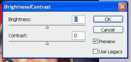
I experimented with the exposure, brightness/contrast and vibrance in the picture to make the main image look brighter and stand out on the page. I also used this technique on the smaller images as well as it made the images appear more atmospheric and less dull.
Small Images:
I used the gradient tool for the background of the clown as well. However, I used a different gradient effect and used the colours purple and black – dark purple and black have villainous connotations, reflecting the image of the super villain clown. I also used the brush with low hardness on the clown’s eyes to make them red and also make them appear as if they were glowing because I felt that this made to clown look more evil and scary.
Box Outs:
I used box outs on the cover because I’d seen this feature on many ‘Empire’ covers and I thought this would be effective. I reduced the opacity in some of the box outs to contrast with the bold text and clear images. I also used the drop shadow effect on the skyline text, the cover-lines and the images which made them stand out more on the page which was more effective than without the effect.
Best Features and Developments:
I think that the skyline and banner across the bottom of the page are great features as it is very typical of ‘Empire’ and reflects their typical magazine cover layout. I feel that the main image works much better than the previous one because the image was better quality and easier to manipulate and therefore appeared much better. If I had more time and resources I would continue to work on how to cut out the main image more smoothly. I’d also reconsider the placement of the smaller images because I feel that it could be positioned better. I’d also research more into how I can make the image more recognisable as neo-noir.


